Color Matters Blog
Working with Color: Bailouts and Branding
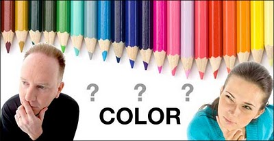
I love interviews with the press because there’s always one challenging question that requires a good answer. Last week, the interviewer asked, “How do you get your color consultation projects?” I replied that half the time, there’s a color disaster underway and someone contacts me. Typically, “the boss” has chosen his or her favorite color for the logo (or the product, packaging, etc.) and a member of the staff senses that there is something terribly wrong with the choice.
One of my recent projects is a perfect example of these color bailouts: In this case, the CEO had chosen purple for the bank’s new logo and all collateral material. The V-P questioned whether purple was appropriate and provided a list of the attributes that the logo color should communicate: simplicity, ease of access, multiple access points, state of the art technology, and ecological awareness. As for demographics, the customers ranged from GenY to Baby Boomers in the mid-west, (U.S.). Yes, she was right about her color intuition. Although purple does align itself with high technology, it would fail to address all the other critical criteria for a bank. My ten-page documentation presented an objective analysis of purple and a specification for the best color. (By the way, the nice part of this business is knowing that you can mediate a dispute with rational information – and you always gain some insights about the mysterious and compelling world of personal color preferences.)
Another situation unfolds when the color selection has been placed in the hands of the pigment or paint chemists and someone in another department raises a red flag. For example, it wasn’t very long ago that the colors for pills came out of the lab – and these colors typically had no logical connection to color communication and the consumer. Consider this: The "Golden Rule" in pharmaceuticals is to select colors that represent the cure, not the malady. Picture a grey anti-depressant tablet - and then think about what color should be avoided for a sleeping pill. (See The Color of Medications)
As for the rest of my color projects, I’m usually involved before a product is rolled out and long before there’s a problem. In recent years, golf carts, computer hardware, medications, garbage cans, and even toilet plungers have been part of the mix. However, just when it seemed that most of my focus was on branding and marketing, an architectural project arrived and I wound up analyzing paint scrapings under a microscope and specifying paint colors for a historical restoration.
The only thing that challenges me about this work is that I have to shut down my personal passions for colors and stick to objective criteria. I’ll admit that yellow has always been my favorite color and that other colors drift into my personal kaleidoscope – colors like tomato red and tender shades of teal. But this is my personal agenda and I’d never apply it to the real world of color consultation.
When you subscribe to the blog, we will send you an e-mail when there are new updates on the site so you wouldn't miss them.

