Color Branding & Trademark Rights

The color of a brand is different from a color trademark. Even though a TM or ® symbol may appear on a brand's image, it does not mean there are any legal rights to the color or colors.

The TM and ® marks on the Mc Donald's and Starbucks images below means that the company has claimed rights to the image (the symbol or word or combination of both).

Example of a brand image with the TM and R symbol

You can use TM on any design that you wish to designate as a trademark. The use of the symbol may be governed by local, state, or foreign laws and the laws of a pertinent jurisdiction No registration is required in the US. In most states this will actually give you some "common law" trademark rights.

You can use the ® mark in the U.S. only after you obtain a federal trademark registration from the US Patent and Trademark Office.
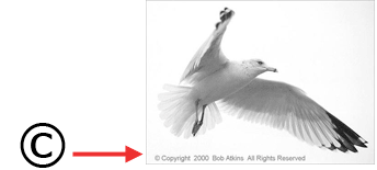
Copyright example

Copyright (the © mark) is different. It means that the original author or creator of any creative work (writing, images, music, software, etc. etc.) has the sole right to copy (distribute, publish, sell, copy) that work for a set period of time unless he or she explicitly hands over that right to someone else. Most governments enact this law.

Another example is the Color Matters website. All the articles and images in this web site are protected by copyright.

What is protected when a brand image is registered or has a trademark symbol?

McDonalds Brand Image Rights

The ® (REGISTERED) mark in these examples protects the brand image - not the color or color combination. In other words, you can use the same yellow and red colors as McDonald's for your business. However, if you used the same design - the yellow arch on a red background - with your business name, you'd be in trouble and even more so if it's for a hamburger restaurant.

The TM (TRADEMARK) symbol on a brand image means the same thing. It protects the design and does not give legal rights to the colors alone.


 About Color Trademarks

A color trademark is different. In this case, the color is the brand. The use of the color in a market sector is protected by trademark. For example, when you see chocolate candy in a purple wrapper, you know it's Cadbury: when you see a turquoise box for jewelry, you know it's from Tiffany & Co.
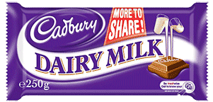
Purple Cadbury Trademark

However, Cadbury's purple is protected by trademark only for chocolate products. Anyone else can use the color purple. For example, Royal Motor Oil and Nexium (pills) use purple in their brand.

Until the 1980s, U.S. law refused to recognize a single color as a brand. However, color combinations, had long been protectable. This changed when Owens-Corning launched the "Think Pink" campaign for its fiberglass building insulation. In 1985, a U.S. Court of Appeals in Washington ruled that the company had the right to prevent others from using pink for insulation.

Years later, in another case, the U.S. Supreme Court reiterated that a single color can indeed be a brand, so long as the public strongly associates the color and the specific product and that the color is in no way functional.

Trademark color example - pink insulation

Pink insulation is a good example of a color that is protected by trademark. When consumers see pink insulation products, they know it's Owens-Corning. The color pink doesn't symbolize anything in home construction. In fact, it's not even a very masculine color.


 Trademarks Today

Color trademarks apply to unique situations because it's not possible to permit every business to own "their color" today. Otherwise there would be "color depletion." In other words, there are a limited number of colors.
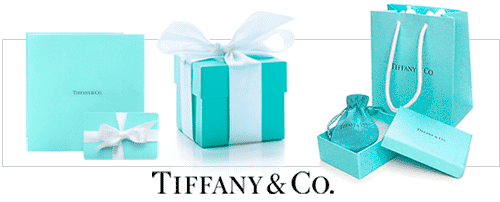
Tiffany example of a color trademark


Tiffany Blue is another example of a color trademark. It's important to understand that they only own that blue in situations where it could be confused with their products. Tiffany only owns "robin's egg blue" for its boxes and bags.

You can paint your house that color, for example, without having a problem. Given the wide range of products Tiffany sells, and the uniqueness of their shade of blue, they are protected from other jewelers who would use the same color for boxes or packaging. Otherwise, there would be brand confusion.

A number of companies have failed to protect single colors. Pepto-Bismol couldn't get pink and Good Humor failed to protect the color white for its trucks and uniforms. On the other hand, UPS has protected brown for its trucks and uniforms and 3M "canary yellow" for its adhesive notes.


What colors cannot be trademarked?

One of the basic principles of color trademark laws in the US is that a functional color cannot be trademarked. In other words, if a company makes lawn mowers, they can't "own" green because green is the color of lawns and is therefore a functional color.

Does John Deere Own Green?

John Deere green can not own green.

Contrary to the color myths, John Deere does not own green. They have trademark protection for the image of the deer on a yellow background but not the colors per se. Competitors are allowed to paint their equipment green or use green in their brand design because green is a functional color. It symbolizes vegetation – grass, fields, farmlands, etc. – and that's where you would use a John Deere tractor or any other Deere product.

On the other hand, Qualitex registered the color green as a trademark for their dry-cleaning pads. In this case, green was a "secondary" color. It The idea is that if you use a color in such a way that your brand is totally identified with it – and there is no functional implications, then perhaps you should have the right to trademark the use of that specific color in that specific market.

(More trademark color myth:  Barbie does not own pink; Mattel does not owns G.I. Joe green.)

Color War: Louboutin Shoes and Red Soles
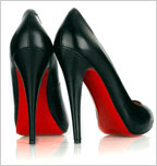
Louboutin red sole shoes
The issue of color rights surfaced in a recent dispute between two well-known design houses — Christian Louboutin and Yves Saint Laurent. Louboutin has used a red lacquered outsole on its highly priced women's shoes since 1992 and is suing for trademark protection. In the meantime, the trend is growing fast enough to make paint sales spike.


What do you think? Is imitation flattery, infringement, or just trend following?)


This article was written by Jill Morton and is based on her experiences as an expert witness in several recent color trademark lawsuits. For more information, visit the Colorcom website.


Links to other articles on this topic:

Color & Branding

Color & Trademarks

Color Matters Blog - Color Infringement: Microsoft vs. Google - 2009


Also from Color Matters

The Psychology of Color Symbolism - online training

Learn online.


Color Symbolism Guide

A downloadable eBook
Color & Branding

Color Design and Psychology for Branding

Brands and color are inextricably linked because color offers an instantaneous method for conveying meaning and message without words.

 3 brand designs

Branding is a word commonly referred to by advertisers and marketing people, but what does it actually mean? Marketing experts define "brand" as the "name, term, sign, symbol or design, or a combination of them intended to identify a company's products or services." In other words, a brand communicates the "idea" of company or product. This is what forms the connection with consumers.

For example, in the illustration of the 3 brand images above:

The JAL (Japan AirLines) image has several components: The bird symbolizes flight and the color red communicates power. Red also symbolizes good luck in Asia. The circle and the color red reference the flag of Japan. Therefore, the brand image communicates powerful air transportation from a Japanese company — and good luck with the journey.

The AT&T image is an award-winning design. The globe symbolizes a world circled by electronic communications. More specifically, the symbol is made up of very carefully delineated 'highlight' and 'shadow' elements. As a result, the symbol may be reproduced to give the impression of a three-dimensional sphere that is lighted from a distance source. (Source) Test yourself on what blue symbolizes.

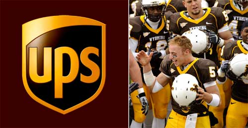
The UPS (United Parcel Service) image is an excellent example of how a single color communicates meaning. Brown symbolizes dependability and solidity. (It is not a snobby color; it is not high technology; brown is grounded in the earth.)

The Power of Images

A single image delivers a lot of information in a very short time because we perceive an image all at once, whereas reading or hearing often takes significantly longer to process the same information.

A recent study found that images of brands trigger religious reactions. (Source) Dr. Gemma Calvert discovered that when people viewed images associated with the strong brands— the iPod, the Harley-Davidson, the Ferrari, and others— their brains registered the exact same patterns of activity as they did when they viewed the religious images.

The Power of Shapes and Colors

Brands communicate meanings with the language of color and shape. As the overused cliché says, "A picture is worth a thousand words."

There are natural — or universal — associations evoked by shapes and colors that are common to all of us: For example, a horizontal line is stable and a diagonal line is dynamic. Red is hot and full of fire, blue is cool and watery — or intangible like the sky.

About Shapes

Colors and shapes work in harmony with each other to communicate. Therefore, an understanding of shapes is essential to understanding the power of color in branding.

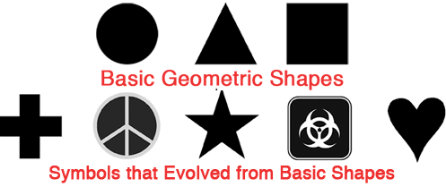
Even the most basic geometrical shapes can be soft or hard, stable or threatening. The image below illustrates basic geometric shapes and contemporary symbols that evolved from basic shapes.

Basic geometric shapes and complex derivative shapes


The Power of Color

Our minds are programmed to respond to color. For example, we stop our cars for red lights and go on green.

Consider the effects of color in the image of contemporary symbols below.

Examples of contemporary shapes with  color


The Power of Color for Brands

Brands and color are inextricably linked because color offers an instantaneous method for conveying meaning and message without words.

Color is the visual component people remember most about a brand followed closely by shapes/symbols then numbers and finally words. For example, the real McDonald's is easy to detect in the image below.

mcd in 5 colors
People see color before they absorb anything else.

Many of the most recognizable brands in the world rely on color as a key factor in their instant recognition. (See for yourself and take the "Recognizable Brands Test" at the end of this article.)


Hz ColorPsych Logo Brand 550
 Trustworthy formulas for energizing your brand’s personality
Color Psychology for Logos and Branding


Why Color Matters Facts

Research has reinforced that 60% of the time people will decide if they are attracted or not to a message - based on color alone!

Color increases brand recognition by up to 80 percent. (Source: University of Loyola, Maryland study)

Read more color facts about "Why Color Matters"

Examples of Color Branding

1. Natural and Universal Color Symbolism for Brands

fedex-2

FedEx's two different color schemes are the best examples of the "universal" symbolism of colors. Green communicates ground services; orange communicates the high energy and speed of air transportation.

Another example can be found in a common household product—laundry detergent.

colors of laundry detergents

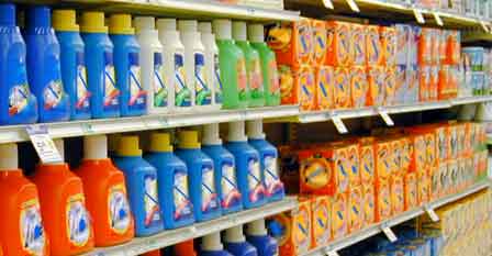
The next time you're in a grocery store, look at the colors of laundry detergents. An overwhelming majority are blue and orange. Blue symbolizes cleanliness and orange is dynamic energy. Therefore, a blue and orange package would clearly communicate "industrial strength cleaning power."

color and cigarette brands

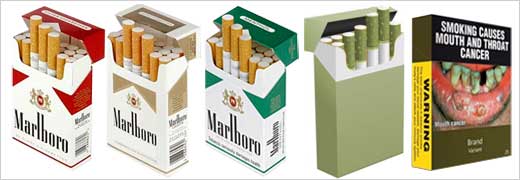
Cigarette packaging is another example of color branding. Notice how every menthol brand uses some shade of green to distinguish menthol from the natural flavor of tobacco. Now that new tobacco laws in the U.S. ban the use of the word light to imply that some cigarettes are safer than others, cigarette companies are using gold, silver and lighter colors to circumvent the law.

Australia will be the first country in the world to require tobacco products to be sold in plain packaging. The new legislation will be implemented throughout the country in December 2012. Legislation in other countries may require dull olive brown packaging or graphic images of health risks on the packaging.


sym Pink


2. Creative and Imaginative Color Symbolism

Colors of telecommunications brands

Some brands break with color traditions. T-Mobile's magenta (hot pink) is an unexpected color in the crowded cellular communications marketplace. Risky but it does succeed in creating a unique identity of the brands.

3. Good and Bad Color Branding

 UPS brown and Wyoming football  uniform brown

The colors of football team uniforms are also branding images. But sometimes the colors are horribly wrong. For example, the colors of Wyoming's football uniforms were cited as one of the worst in college football. (Source) Why do you think that brown is such a tough color to accept as a sports uniform? It works for UPS. Here's a hint: Brown isn't the most powerful color of the spectrum. It's as dependable as Mother Earth, but it lacks energy.


In conclusion, if you're questioning the power of color in branding, look at this example:

Yahoo and Google

Links: Recognizable Brands Test

Colors that Sell e-book
Find the best colors for your business in "Colors that Sell" - an e-book from Color Matters.


This article was written by Jill Morton, color psychologist and branding expert at Colorcom
©Jill Morton, 2012, All rights reserved / Protected by Copyscape


Links to other articles on this topic:

Color Branding & Trademark Rights

Color & Trademarks

Color Matters Blog - Color Infringement: Microsoft vs. Google - 2009


sq logo icons message 550

We just launched two new online courses about color for logos and branding. Learn how to empower your brand with color in two hours time or less. Check out "Color Psychology for Logos and Branding" and "Color Harmony for Logos and Branding".


Subscribe to the Color Matters Newsletter
Stay in touch with the latest news about color in this bi-monthly newsletter. Sign up and get a free copy of “The 3 Most Common Color Mistakes".

Color & Marketing

Use the "Color & Marketing" pull down menu at the top of this page or link to the articles below.

Who owns hues? Cadbury trademark purple

Who Owns Hues?
Could all the colors of the rainbow be confiscated in a marketing war?

New

icon color trends

What is a color trend? Where do they come from? Does a color trend really matter in the 21st Century? Explore some answers at Color Trends.


Color Branding: Yahoo and Google

People see color before they absorb anything else.

Many of the most recognizable brands in the world rely on color as a key factor in their instant recognition. Find out more about why color matters in our new article: Color & Branding


Does John Deere own green? Does Barbie own pink? What are the legal rights to colors?

Can you "own" the colors of your brand? Does John Deere own green? Does Barbie own pink? Does Tiffany own "Robin's Egg" blue? Find out what the TM and ® symbols mean: Color Branding & Trademark Rights


The Global Color Survey

Take the Global Color Survey.
When you're finished you'll find out what 130,000 people from all over the globe said about colors.


The colors of pills - medications

The Color of Medications
Does color matter?

The Psychology of Color Symbolism
Become a Color Symbolis Pro
Online training from ColorMatters


Why color matters in marketing

Why Color Matters
Real facts about how color increases brand recognition, helps memory, and more.


icon-link-sym-smile-blue

The Meanings of Colors
Happy yellow and sad blue! Explore the meanings of colors.

Colors speak louder than words. Learn how to use it logically

More about color and marketing:

Color & Usability Matters
How color is used functionally in the world today.

Color for E-Commerce
  Tips for designing successful sites

Gender Differences
in response to color

Quirks of the Color Quest
Choosing the next "hot color"


A Guide to Color Symbolism

Color & Trademarks

Who owns hues?

Color Trademarks

Marketing research indicates that over 80% of visual information is related to color. In other words, color conveys information and/or provides the user with some other operational benefit.

The use of distinctive colors to identify products can be seen everywhere, from pharmaceutical items to industrial equipment. Some products are packaged in a variety of distinct colors. For example Kodak’s film comes in a yellow and black box and Fuji’s, green. Other products tend to be packaged in variations of the same two or three colors in different designs. For example, laundry detergents are typically solid in blue, orange and/or yellow packaging. The actual design of the container or label may be quite different, even though the colors are the same. On the other hand, a more confusing situation may confront a consumer. Right next to your favorite brand of cough syrup, sits another brand in similar colors. Even the labels are oddly similar, so much that you might even confuse the two and pick up the wrong one by mistake.

Until recently, the importance of color as a brand identity wasn’t a big legal issue and the courts were lenient. It was an open question whether trademark law protected distinctive colors that had become strongly associated with a particular product or manufacturer. Today a color war is exploding and the use of color is generating unprecedented lawsuits.

Consider the fact that colors are in limited supply. Would allowing companies to appropriate a single color or a color combination lead to the "depletion" of all of the attractive colors in each product line?

Here are four examples of true “color” trademark infringement lawsuits. The first list contains a simple description of the four lawsuits. Decide how you would rule if you were the judge. The second list contains how the courts ruled. See if you agree!


1. Blue frozen dessert packaging (USA)

Frozen dessert with blue

Ambrit, a frozen food company, had sold their frozen desserts in a royal blue packaging. Kraft Foods followed suit and used the same color on their packaging for frozen desserts. Ambrit sued to prevent Kraft from using blue. Does Ambrit - who first used this color - own the rights to blue on frozen desserts?


2. Red buckets (USA)

Color Trademark - Dap red bucket Dap, a building supply company, sold their ceramic tile mastic in a red three-gallon bucket for many years. When Color Tile Mfg. Inc. packaged their mastic in a red bucket, Dap sued. Does Dap have exclusive rights to use red on their adhesive containers?


3. Multi-colored candy wrappers (USA)

Trademark dispute - colored candy

Life Savers, a well-known candy company, has used a multi-colored striped background on the wrapper for its multi-flavored hard candies. Later, Curtiss Candy Co. introduced their brand of hard candies in a multi-colored striped background wrapper. Life Savers sued. Do they have the right to get a permanent injunction against Curtiss to stop their use of a multi-colored striped label? Note: In this case, the issue is several colors and a striped design.

4. Red books (Austria)

red law booksAn author of a series of books about legal matters used a deep red hue for the cover of his publications. The publisher of another series of law books claimed that they had been using a similar red color and that this color distinguished their books from others. They sued for trademark protection of this color. Who won?

Advertisement

ad-h-expert-witness

The Rulings of the Courts

1. Blue Frozen Desserts (Ambrit v. Kraft)

Frozen desserts with blue packaging detail

The U.S. courts denied Ambrit's request for protection of blue, on the basis that royal blue when used to package frozen desserts was functional and could not be monopolized in a trademark. The ruling stated "Royal blue is a 'cool color;' it is suggestive of coldness and used by a multitude of ice cream and frozen dessert producers." Although the ruling acknowledged the issue of protecting the consumer from confusion, preventing a monopoly of a functional color was a greater issue.

A similar lawsuit occurred when Campbell Soup tried to obtain an injunction against another food company, Armour, stating that the company's use of red and white labels on foods were an instance of trademark infringement. However, the U.S. court denied Campbell the right to the exclusive use of labels which are half red and half white for food products, ruling "If they may thus monopolize red in all of its shades, the next manufacturer may monopolize orange in all of its shades and the next yellow in the same way." Obviously the list of colors will soon run out. Note: The court also found that the Campbell red was not the same as Armour's Carnation red and that Armour most often uses the red-white color scheme in a different pattern than Campbell's.


2. Red Buckets

Color Trademark - Dap red bucketA federal district court ruled in favor of Dap and granted protection to their red packaging. They found that "secondary meaning" was attached to DAP's red plastic bucket for its tile mastic the color red was not a functional feature of the tile product. Red had nothing to do with the color of the adhesive, the ceramic tile industry, or the product’s performance. In other words, there was no logical reason for red, such as a red fire extinguisher's functionality related to red fires. Dap used the color solely as a unique color for brand identity.

Therefore, there was no logical reason for a competitor's copying DAP's packaging "save an attempt to realize upon secondary meaning that is in existence." (In other words, using the same red color was seen as exploiting the identity of Dap’s products and creating confusion for the consumer. )

The precedent-setting example of "secondary meaning" of a color was the basis for the Federal Court's ruling that Owens-Corning was entitled to trademark protection for its pink insulation. The ruling stated "A pink color mark registers for fibrous glass insulation does not confer a 'monopoly' or act as a barrier to entry in the market. It serves the classical trademark function of indicating the origin of the goods, and thereby protects the public."


3. Multi-colored candy packaging (Life Savers v. Curtiss Candy Co.)


Multi-colored candies

The court denied Life Saver protection of their striped colors, citing that no trademark infringement or unfair competition had been established. They found that it was a "general practice of the trade" for hard candy manufacturers to sell their candy in packages with multi-colored backgrounds for their assorted flavored discs, and labels with single colored background for their packages containing one flavor of candy discs." They concluded that the multi-colored background was in fact descriptive and served as a ready identification of the flavor of the candy in the package. Once again, an example of functional color.
 

4. The red law books (Manz'sche Verlags v. Linde Verlag)

red law books

In 1997 theleft Supreme Court of Austria ruled that the use of a color on products of a color previously established to identify the goods of another party violated Section 9 of the Unfair Competition Act. The decision prohibited the defendant from publishing law books in the same shade of red as the plaintiff's legal treatises. It is interesting to note that the defendant proved that a number of publishers in other countries, for example, in Germany, publish their law books in the same shade of red. The Supreme Court nevertheless held that the plaintiff was entitled to protection in Austria.


The Final Verdict?

Many businesses have taken steps to protect their color identity because of the impact of colors on sales. The principle that a single color may receive trademark protection is now the law of the land. This development manifests itself not only in national statutes, but also in the international Agreement on Trade-Related Aspects of Intellectual Property Rights, including Trade in Counterfeit Goods of the TRIPS Agreement.

On the other hand, the courts recognize that colors are in limited supply and that allowing companies to appropriate colors will soon lead to the "depletion" of all of the attractive colors in each product line.

Although the courts tend to view that preventing the use of a color would put a competitor at a significant disadvantage, the color must pass the functionality test.

Functionality can be defined by multiple criteria. Here’s a simplified list:

  • Psychological Effects (symbolism, associations)
    When a color’s associations relate to the product in a literal or abstract way, this is considered to be functional. For example, green is frequently used in packaging of organic, healthy and natural products because if the association with trees, grass and nature. Another example is blue fertilizer (indicating the presence of nitrogen).
     
  • Aesthetic Effects (attractive and effective design)
    Many color combinations can be considered to be harmonious and “pleasing to the eye.” For example, green and yellow are harmonious since they are closely related to each other (analogous). Functional design effects may also include perception of size and weight. For example a black outboard motor appears smaller than motors in other colors.
     
  • Visual Effects (eye catching, text legibility)
    The human eye reacts to color in many different ways. Some colors are advancing (and grab attention), others receding. Some color combinations render text legible; others are problematic.


In conclusion, in spite of precedent setting lawsuits, the laws of color ownership are in flux. Prior rulings are frequently reversed by subsequent lawsuits. Consequently, companies continue to take legal action and millions are spent to defend the rights to color. Could all the colors of the rainbow be confiscated in a marketing war? It’s a wake-up call for everyone who cares about color.

This article was written by Jill Morton and is based on her experiences as an expert witness in several recent color trademark lawsuits. For more information, visit the Colorcom website.

 
Trustworthy color formulas for logos and branding
An e-Course from Jill Morton, Color Matters author & consultant.

Hz ColorPsych wheel split logo brand purple 550


Links to other articles on this topic:

Color Branding: Yahoo and Google

People see color before they absorb anything else.
Color & Branding

Many of the most recognizable brands in the world rely on color as a key factor in their instant recognition. Find out more about why color matters in our new article: Color & Branding


Does John Deere own green? Does Barbie own pink? What are the legal rights to colors?
Color Branding & Trademark Rights

Can you "own" the colors of your brand? Does John Deere own green? Does Barbie own pink? Does Tiffany own "Robin's Egg" blue? Find out what the TM and ® symbols mean: Color Branding & Trademark Rights

Also:

Color Matters Blog
Color Infringement: Microsoft vs. Google
- 2009

Brand Identity and Color Psychology Experts - Jill Morton Colorcom


Quirks of the Color Quest


Color Trends

Most consumers demand novelty. The marketing mantra, "Today’s sensation is tomorrow’s blank stare," sums up the ebb and flow of color trends. Hot new colors have become a big business - one that many question. Nevertheless, whether it’s the "in color" for next year or the emerging color for the next decade, new colors are going to get the consumer to pay attention and to pay a good price as well.

We need to remember that several important factors affect the selection and application of any "new" color in advertising (or any other visual communications medium, for that matter): The product or service, the target audience, and the communications medium itself. Steely blues may seduce in a Cartier ad in Town & Country -  or an Hummer TV spot. A pungent orange in a Banana Republic ad may jolt in Vogue Magazine. Still lurking in the shadows are the bittersweet temptations of avocado green - a color that H&R Block has embraced.

When "cutting edge" colors are applied to the actual product, we’ll find that the life expectancy of the object plays a significant role. Most of us may impulsively buy a lime green t-shirt, yet decide not to invest in the new Volkswagen beetle in any such trendy shade. What may be a runaway success in fashion may not apply to cars or interior furnishings.

Now that the Internet has become a significant medium for advertising, "trendy" colors are even more problematic on a global level. A good case in point is the emergence of purple in the States during the 80s. By the end of that decade and through the early 90s, the color has made its way into virtually all industries, from music ("Purple rain" by the artist then known as Prince) to filmmaking ("The color purple") and fashion, not to mention visual arts. Even the car makers have joined the parade, with purple being one of the colors of macho trucks manufactured by Ford around 1995. Yet, certain shades of purple have always been powerfully aligned with death and morbidity in Catholic Europe. Although in recent years, some of these negative connotations have been shed, and the color has slowly gained new associations with fun and cheerfulness in American culture, thousand-year-old traditions of other countries are not easy to overcome.

All things considered, color trends are a complex issue, one which is not easily defined by simple color predictions. Efforts to pinpoint the "magic" color or color family usually rely upon other lifestyle influences, such as television, films, music, magazines, social issues, contemporary events, and a multitude of other sources. Now that the Web has exponentially increased this visual bombardment, we see more images and colors than ever before. It’s likely that this trend is going to continue at a rapid pace.

Note: The following was written in 2000. Although some of the information is dated, it does provide some significant insights about color trends - and especially so as we look back in time.

Amidst this present frenzy, it would be wise to cautiously review the history of recent color trends in the hopes of finding some clues for our present quest. For one, America’s fascination with green during the early 90s gave birth to the popularity of yellow-green in the middle of the decade. For the past 10 years, avocado and acidic lime greens have permeated the visual landscape in the US. From magazine ads to websites, shades of yellow-green have been the prescription for an attention-grabbing look. Today, a trip to the Gap or Neiman Marcus easily confirms that these colors are still alive and well in the world of fashion. Is anyone not offering a t-shirt in some shade of yellow-green this year?

Historically, shades of yellow-green first became popular during the "green, gold, and copper" refrigerator days of the 60s and early 70s. Ironically, an avocado refrigerator since became a symbol of a horrendous lapse in what some refer to as "taste." Perhaps it was the flood of appliances and day-glo hippie posters that did it, or maybe it was color trend burn-out, but finding a shirt or bath towel in this color was almost impossible in the 80s. Nevertheless, by 1995, yellow-based greens were infiltrating the visual landscape again. Advances in textiles and dyes made brilliant lime a staple in the fashion industry, thus fulfilling the standard that a color can be reinvented in exciting new ways. Other variations — the resurrected avocado and olive green — were new again, at least in terms of the collective consciousness of a youth-oriented American culture.

That is precisely why orange may very well be moving into the forefront of the color parade. Therefore, one might say that Clue #1 is "The shock of the new." Find a color that hasn’t put in a tour of duty during the past 20 years and/or zap it with a new look, and chances are excellent that it has the potential to succeed as an attention-getting color.

Interestingly, prior to the recent avocado/lime green rage, most people intuitively felt that these were "sickly" colors and avoided them. They were right. In fact, they had been known to induce nausea and were — and remain — banned from aircraft interiors. Any sailor would tell you to avoid shades of yellow green.

As we turned our sights to orange, substantial research (including the data gathered at The Global Color Survey Database and the Pantone Consumer Color Preference Study® (dated June 1996) has documented that orange is one of Americans’ least favorite colors. (It’s interesting to note that orange was always a favorite color in the Netherlands, for the precise reason that the country’s ruling monarchy is the House of Orange.) In 1991, Forbes called attention to orange’s mundane associations in its December 23 article, "Does orange mean cheap?" Yes, it does.

In summary, we are now looking at an unpopular cheap color coming into the forefront of trendy colors. Hence, clue #2 is: "It’s so bad, it’s good."

Psychologically, the "anti-aesthetic" colors may well capture more attention than those on the aesthetically-correct list. History clearly demonstrates that this has been a prevalent trend in art since the turn of the 20th century, when Dada’s urinals and snow shovels put an end to the era of Matisse and French Impressionism.

But what about the rest of the spectrum? There is a substantial mass of humanity who make educated and, more importantly, individual taste judgments about color. That is precisely why we should consider the fact that we are becoming more diversified as we expand our consciousness in this new millennium. The quest for a singular color or emerging colors is something we love to talk about, but few of us practice it in real life.

Yet, there is no question that color will continue to communicate on a subliminal level. A metallic blue Mitsubishi TV spot and an orange Polo ad in Fortune are guaranteed to pack punch. Hold on to your wallets.


About this article: "Quirks of the Color Quest" was published in Visual ArtsTrends magazine. Revised 2011.

About the author: Jill Morton is an internationally-recognized color consultant whose clientele includes industry giants Nokia and Kodak. Publications such as Fortune, Entrepreneur and Metropolis have all sought her editorial commentary about the red-hot “scientific art” of color. Before the arrival of the Internet, Jill served as faculty at the University of Hawaii School of Architecture, Chaminade University, and Matsuda Technology Center. In addition to maintaining an incredible online resource for color information, Color Matters, she is the author of Color Voodoo, a series of books about color theory and symbolism.


Color Marketing & Branding Consultation


More Articles ...

Subscribe to the free Color Matters Newsletter

Color Matters is a registered trademark of J.L. Morton.
Graphics and Text: Copyright (c) 1995-2024, J.L.Morton, All rights reserved

copyscape seal blue 120x100