Color Trends

A color trend is a direction. It’s a developing awareness or an emerging preference for a color or several colors. Therefore, a color trend can change the way we think about a color and how we purchase consumer goods. In short, we constantly communicate via the medium of color.

Here’s another way to define a trend:
“A fad is a flash-in-the pan, a trend is something with a little more practicality and purpose, and a style is something that continually re-invents itself over time to become a classic." - Linda DeFranco,

The Psychology of Color Trends

The novelty of a color creates a desire for the color. Typically, an emerging color is quite different from what preceded it. Following a trend is an opportunity to experience something fresh and exciting. Variety is the spice of life. Perhaps this explains why we welcome a new color and why this generates consumer activity.

Color Trends: The Power of Media

The foundation for the emergence of color trends is the access to information and colored images. Prior to today’s era of film, television, the Internet and smartphones, people did not have immediate access to color images. Up until the 20th century, printed material - such as books and magazines - and artwork in museums and churches were the only media for the distribution of images and information. Furthermore, humanity was more intent on survival than purchasing fashionable items. Consumer culture didn’t become a reality until after WWII.

Color consultation brands

A Historical Perspective of Color Trends

Prior to the year 2000, trends were slower to materialize and lasted longer.

The 19th Century

color trend tiffany 19century

Royalty and rulers, celebrities and artists were the trendsetters in the 19th century.

Examples
The signature color of Napoleon’s wife, Empress Eugenie de Montijo was light turquoise, which was just a shade different than the woman she she most admired, Marie Antoinette. Tiffany chose the favorite color of this royal celebrity for its iconic robin’s egg blue boxes in 1837.

The white wedding dress trend began in 1840 when Queen Victoria selected a white dress, which was considered an unusual choice at a time when colors were more usual,

In 1870s Paris, the old, academic art establishments were obsessed with the color violet.

The 20th Century
color trends in 20th century

In the 20th century, we influenced color trends as much as they influenced us. Colors that gained traction - whether used in fashion, paint, or furnishings - reflected what was happening in the wider world. For example, the rise of a color could be connected to subtler elements, such as changes in the country's economic or cultural climate.

Examples
Although the Women's Institute for Domestic Science in the U.S. endorsed pink for boys, blue for girls in 1921. Twenty-five years later, the “trend” was reversed and the tradition of pink for girls and blue for boys was firmly established.

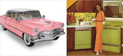
The popularity of light-hearted pastels of the 1950s contrasted with the somber colors of previous years that were marked by World Wars and the depression. For example, pink Cadillac’s (1955) and turquoise refrigerators. Psychedelic colors emerged in the 60s as Rock ‘n Roll turned people on to color.

The recession of the 1970s brought a retreat into safe, sober, earth colors. Avocado green, harvest gold, and burnt orange colored the worlds of fashion and appliances in the 70s.

The economic upturn of the 80s brought bold colors, and black and white. Graffiti and artists like Keith Haring, captured the vibes of the time in red, blue, green and yellow. At the same time, colors such as dusty rose (mauve), became a popular for interior design.

The economic downturn at the end of the 80s led to the “dirtied” grunge colors of the early 90s. By the mid 90s, the bold colors of the iMac, urban street style, and minimalism influenced color trends.

Color Trends in the 21st Century
Color Trends 21st century Media Overload

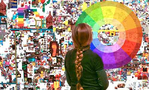
At the turn of the 21st century, we found ourselves immersed in a world of information unlike any time in the history of humanity. Global access to the Internet in the late 20th century was followed by media feeds on the smartphone. Today, we’re subject to an overflow of input from film, television, fashion, socio-political events, designers, celebrities, and forecasting agencies that proclaim a “Color of the Year.” Just google “color trends” and you’ll get 13,700,000 results.

In fact, we see more images in one day than our ancestors in the Middle Ages saw in a lifetime.

Furthermore, there are trends for every industry sector. There might be one set of colors for the automotive industry and quite a different set of colors in fashion or interior design. For example, matte black stainless steel may be the new trend for home appliances or smartphones, but it may not have any effect on sportswear apparel.

Of even greater significance is that different cultures, geographic regions, genders, and age groups may embrace unique trends and may react differently to “global trends.” Consequently, the diversity of color trends is as great as the media that influences them.

Unfortunately, a brief summary of the most significant trends of the 21st century is an impossible task. The complexity of these trends would require an analysis based on industry sectors and demographic parameters (age, culture, region, etc.). Therefore, this would fill an entire book.
Note: The best way to pinpoint these trends is to google “color trends _____” and fill in the year. You might be amazed at the results.


A few words from Color Matters author, Jill Morton
Trend to-Color Logic
Color logic is practical color. It's a timeless tool for all designers. Check out the online courses at the Color Matters Design Academy.


Color Forecasters

Since the turn of the century, trend forecasting has become big business. There are organizations such as the Color Marketing Group (CMG), the Color Association of the United States (CAUS) and the International Colour Authority (ICA). Add to this list the agencies that focus on specific regions such as China or the Middle East. See this list.

Color of the Year
Color the Year - Color Trends

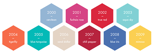
Forecasting a single color for one year brings into play the paint companies who name an “it” color. And then there’s Pantone (a manufacturer of color chips & color matching tools) who has chosen a “Color of the Year” for every year since 2000.

In short, Pantone chooses a color that reflects the current cultural climate. In the following year, the color influences trends interior décor, fashion, food, and other facets of design. However, the color of the year doesn’t apply to every brand or product. For example, the color may or may not be appropriate for towels, tennis shoes, or SUVs.

Color forecasters' predictions generally do come true — partly because they ordain them. Media buzz reinforces the “it” color. It’s worth noting that consumers buy products in the new colors because that's what's for sale - and a trend is confirmed. However, there are no statistics that show that the color boosted sales of specific consumer goods.

In conclusion, the “Color of the Year” is a significant philosophical cultural event that generates a lot of media buzz and makes us look at a color in a new way. However, it’s also a short-term fad that encourages consumers to buy.

Note: In direct contrast we have the “sustainable” movement which encourages us to avoid the excesses if consumption which deplete natural resources. For example, Stella McCartney calls for overhaul of the 'incredibly wasteful' fashion industry.

Summary

In conclusion, with so many trend predictions coming out, where do we get the best insight? When the pace is moving so fast and with content being shared globally within seconds, any color trend becomes a ‘micro trends’ that lasts for a moment. Perhaps we are now past trends.

 Points to Ponder

 Are we really in charge of color trends in this century?
Today’s sensation is tomorrow’s blank stare.
Whatever out is soon in.

Color Matters newsletter
Stay in touch with the latest news from Color Matters.
Subscribe to the free bi-monthly newsletter.

Explore More

When color trends matter—and when to ignore them
The End of Trends
C
olor Trends for 2018

More about black & white

Some explanations from other color pros

black and white

You don't 'see' the paint color...not really. You see the color that is being reflected from the paint.

 Example: Red paint. White light applied to the red paint, some of the light bounces off the "red" paint. The "red" is what is reflected into your eye onto your retina. The other portion of the white light was absorbed by the so-called "red" paint. Care to guess what colors the red Paint absorbed? (from color pro Mac)


There is no color 'out there.'

Color is merely certain nanometers of electromagnetic energy that (lucky us) our eyes can register as color. Most electromagnetic energy cannot be processed by our eyes, for example, radio waves, or radiation. Thus what we see is only because of our eyes.

No color exists as color.

Thus if we see red, it's because our cones sensitive to the wavelength around 700-760 nm's send information that we translate into red. Thus if we see red there, then our cones are responding to reflected nm's. Now, my guess is you are betting that something red is absorbing everything but the wavelengths we perceive as red, and you will be right here. A red paper absorbs all other wavelengths and reflects the "red" ones (If I may condense that rather than to say "reflects the wavelengths in the nm range that our retinal cones respond to." See if you can rephrase the question in those terms before trying to win the money!


About black:
The most easily made mistake is to relate the concept of dark being the absence of light. This is correct, yet understand that in complete dark (the absence of light) our eyes could not perceive white or black simply because no light is present to be reflected off a "white" or "black" object and be received by our eyes.

In respect to this it would be possible to create 100% black only with a surface containing all colors; this being the only way to prevent any color from being reflected back to the beholder.


About white:
For the eye to perceive an object as white, the object must reflect all colors (or close to). A surface capable of reflecting all colors must be void in color itself, any color would hinder all color light to be reflected and thus would not create white perceived by our eyes.


Scientist  John Stapleton explains more about black and white:

 White is a rich color if you "unweave the rainbow."

 So is black in terms of blackbody radiation that becomes red c. 1000K and white c. 3000K-6000K etc..

White that has a flat power spectral density over the entire visible spectrum produces 200 lumens per watt

Whereas green 555nm yields 683 lumens per watt and max sensitivity to luminance, not chrominance.

Take it away from white and you see nonspectral magenta and peak in chrominance rather than luminance as in green.

New fallen snow is quite white at about 90lumens per watt and 10,000 footcandles or 10k lumens/sq ft is correlated with 121 milliwatts per sq cm of solor energy. After Katrina we must go back to the drawing board and use color science to HARVEST HURRICANE ENERGY.


Regardless of whether black is a color or not....it's the color of power. Learn more at the Psychology of Colors with online courses from color pro Jill Morton.

 
wow black rocks


Color Logic for Design

Color & Design

See the "Color & Design" pull down menu at the top of this page for all the design pages . . . or check out the featured pages below.
 

Easy color theory for today!

Basic Color Theory

The three most important things about color today.
Really easy and logical guidelines for color.


Is white a color? Is black a color?

Are Black & White Colors?
 If you say that black is not a color, this article will make you right!
If you say white is not a color, you'll also find out why it is (and isn't) a color.


The Global Color Survey

Take the Global Color Survey.
When you're finished you'll find out what 130,000 people from all over the globe said about colors.


sq Foolproof logo brand text 432
Learn online in two hours time ... or less!


 More Articles about Color Design and Marketing

icon color trend 350

What is a color trend? Where do they come from? Does a color trend really matter in the 21st Century? Explore some answers at Color Trends


Color Branding: Yahoo and Google

People see color before they absorb anything else.

Many of the most recognizable brands in the world rely on color as a key factor in their instant recognition. Find out more about why color matters in our new article: Color & Branding

Does John Deere own green? Does Barbie own pink? What are the legal rights to colors?

Can you "own" the colors of your brand? Does John Deere own green? Does Barbie own pink? Does Tiffany own "Robin's Egg" blue? Find out what the TM and ® symbols mean: Color Branding & Trademark Rights


More about Color & Design

Computer Colors

Computer Colors
Computer Color Matters - Is Your Computer Color-Blind?

Who Owns Hues
  Could all the colors of the rainbow be confiscated in a marketing war?

 Color for E-Commerce
  Tips for designing successful sites

True Color: Metamerism
How color mutates

Historical Color Matters
  Architecture in Hawaii

Where to Study Color
  A long list

Color, the Chameleon of the Web
  Beware!

Color Design eBooks
  from the author of Color Matters

Quirks of the Color Quest


Also from Color Matters

encyclopedia lof color
Download in seconds.


sq Foolproof logo brand text 432
We just launched two new online courses about color for logos and branding. Learn how to empower your brand with color in two hours time or less. See "Color Harmony for Logos and Branding" and "Color Psychology for Logos and Branding".


Foolproof Color Formulas for Interior Design
Tape the power of color in this online course from Color Matters.


Basic Color Theory

Color theory encompasses a multitude of definitions, concepts and design applications - enough to fill several encyclopedias. However, there are three basic categories of color theory that are logical and useful : The color wheel, color harmony, and the context of how colors are used.

Color theories create a logical structure for color. For example, if we have an assortment of fruits and vegetables, we can organize them by color and place them on a circle that shows the colors in relation to each other.

fruit organized by color


The Color Wheel

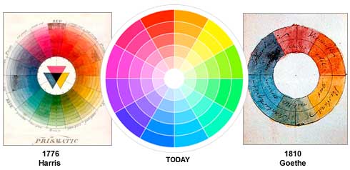
A color circle, based on red, yellow and blue, is traditional in the field of art. Sir Isaac Newton developed the first circular diagram of colors in 1666. Since then, scientists and artists have studied and designed numerous variations of this concept. Differences of opinion about the validity of one format over another continue to provoke debate. In reality, any color circle or color wheel which presents a logically arranged sequence of pure hues has merit.

Three color wheels - Harris, Today, Goethe 


There are also definitions (or categories) of colors based on the color wheel. We begin with a 3-part color wheel.
 
Primary Secondary Tertiary Colors

Primary Colors: Red, yellow and blue
In traditional color theory (used in paint and pigments), primary colors are the 3 pigment colors that cannot be mixed or formed by any combination of other colors. All other colors are derived from these 3 hues. 

Secondary Colors: Green, orange and purple
These are the colors formed by mixing the primary colors.

Tertiary Colors: Yellow-orange, red-orange, red-purple, blue-purple, blue-green & yellow-green
These are the colors formed by mixing a primary and a secondary color. That's why the hue is a two word name, such as blue-green, red-violet, and yellow-orange.


 Color Harmony

Harmony can be defined as a pleasing arrangement of parts, whether it be music, poetry, color, or even an ice cream sundae.

In visual experiences, harmony is something that is pleasing to the eye. It engages the viewer and it creates an inner sense of order, a balance in the visual experience. When something is not harmonious, it's either boring or chaotic. At one extreme is a visual experience that is so bland that the viewer is not engaged. The human brain will reject under-stimulating information. At the other extreme is a visual experience that is so overdone, so chaotic that the viewer can't stand to look at it. The human brain rejects what it cannot organize, what it cannot understand. The visual task requires that we present a logical structure. Color harmony delivers visual interest and a sense of order.

In summary, extreme unity leads to under-stimulation, extreme complexity leads to over-stimulation. Harmony is a dynamic equilibrium.


Some Formulas for Color Harmony

There are many theories for harmony. The following illustrations and descriptions present some basic formulas.


1. A color scheme based on analogous colors

Example of an anaologous color harmony  

Analogous colors are any three colors which are side by side on a 12-part color wheel, such as yellow-green, yellow, and yellow-orange. Usually one of the three colors predominates.
 

2. A color scheme based on complementary colors

Example of a complementary color harmony
 

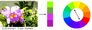
Complementary colors are any two colors which are directly opposite each other, such as red and green and red-purple and yellow-green. In the illustration above, there are several variations of yellow-green in the leaves and several variations of red-purple in the orchid. These opposing colors create maximum contrast and maximum stability.
 

3. A color scheme based on nature

color harmony in nature

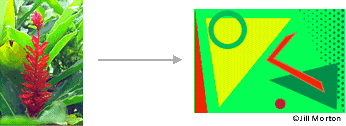
Nature provides a perfect departure point for color harmony. In the illustration above, red yellow and green create a harmonious design, regardless of whether this combination fits into a technical formula for color harmony.


Dynamic recipes for color harmony
An e-Course from Jill Morton, Color Matters author & consultant.

Color Context

How color behaves in relation to other colors and shapes is a complex area of color theory. Compare the contrast effects of different color backgrounds for the same red square.


©Color Voodoo Publications

Red appears more brilliant against a black background and somewhat duller against the white background. In contrast with orange, the red appears lifeless; in contrast with blue-green, it exhibits brilliance. Notice that the red square appears larger on black than on other background colors.


Different readings of the same color


©Color Voodoo Publications

If your computer has sufficient color stability and gamma correction (link to Is Your Computer Color Blind?) you will see that the small purple rectangle on the left appears to have a red-purple tinge when compared to the small purple rectangle on the right. They are both the same color as seen in the illustration below. This demonstrates how three colors can be perceived as four colors.


Observing the effects colors have on each other is the starting point for understanding the relativity of color. The relationship of values, saturations and the warmth or coolness of respective hues can cause noticeable differences in our perception of color.

Illustrations and text, courtesy of
Color Logic
and Color Logic for Web Site Design


Stay in touch with the latest news about color in this bi-monthly newsletter. Sign up and get a free copy of “The 3 Most Common Color Mistakes".


What's your favorite color? What does it mean to others?
Explore "The Meanings of Colors" at Color Matters.

The meanings of colors. Is yellow happy, is blue is sad?


Also ...
Don't miss this article at Color Matters!
The Evolution of the Symbolism of Green
Color & Culture Matters

The symbolism of green


Online courses - Color

Learn the language of color online
DIY - Learn at your own pace.


Color for E-Commerce

 
Color Matters in E-Commerce
 

Regardless of how we define commerce, almost every web site is selling something. It may be a one person accounting business, it may be a site that sells only tanning products or a much larger department store. Even educational sites could be considered commercial if they must generate advertising income.

A successful “store” has a simple formula. Initially, it must be accessible to everyone. It must be attractive and inviting. Once inside, the customer must be able to move comfortably through the store and find what they need. They must be able to examine the merchandise (or service) and get information about it. Finally, they must be able to successfully complete a purchase or procure a service.

For the first time in history, a flat surface electronically simulates a physical "bricks and mortar" store. In spite of the limitations of this digital medium of images and text, the same formulas for success apply — and even more so.

Color must function successfully on several levels simultaneously. First, on a technical level, the colors must be as accurate as the existing technology will allow, while, at the same time, heeding the rules of optics. Second, once a set of colors has caught and held the visitor's attention they must succeed in conveying appropriate information. Third, colors must function competently as the primary structural element in the store’s design — the web page layout. In this capacity, color must create appropriate spatial and navigational effects on the page and the site as a whole. Fourth, as the primary aesthetic tool, colors must create a sense of visual harmony, thus sustaining and enhancing the customers interest in the shopping experience.
 

E-commerce page examples

Graphics and text © (Copyright) 2008, Color Logic for Web Site Design , All rights reserved


web UI Design
Color Consultation


Here are four formulas for success:

1. Convert images to the correct file format.
This not only delivers the best colors and the best images possible but it also lowers file sizes and shortens the download time.

2. Select the most appropriate colors by analyzing the store’s products or services and the target market. It is essential that colors bear some relationship — either symbolic or literal — to the product or service. Don’t try to reinvent the color wheel by using unusual colors.

3. Use color to create the most functional user-interface design. For example, use color to direct the eye to the most important areas on the page. The web designer must identify what ideal and normal sequences might entail: what the viewer should see first, where the eye should move next, and how much time the viewer's attention should be held by each area. Keep colors to minimum. "Signal detection" theory means that the brain is able to understand and organize information when a minimum of colors and shapes exists within the visual field. Too many colors and shapes make it impossible to focus and find anything.

4. Use color harmony principles to create a pleasant visual experience. In other words, all the colors of the web site— the navigation system, banners, buttons, and text — as well as the images of the merchandise (if they exist), must all work well together. Some common attribute must unify them.

In conclusion, consider this: Just as a store is constructed of solid matter, color is the basic building material of two-dimensional images and visual experiences. In the final analysis, color plays a pivotal role in the customer’s critical decision — to buy or not buy.

© (Copyright) 2005, Color Logic for Web Site Design , All rights reserved


A message from Color Matters

We just launched two new online courses about color for logos and branding. In two hours time or less, learn how to empower your brand with color. See "Color Psychology for Logos and Branding" and "Color Harmony for Logos and Branding".

sq ColorHarm LB 360

More Articles ...

Subscribe to the free Color Matters Newsletter

Color Matters is a registered trademark of J.L. Morton.
Graphics and Text: Copyright (c) 1995-2024, J.L.Morton, All rights reserved

copyscape seal blue 120x100