Color Matters Blog
Color Trends for 2018
"Color trends for 2018" is a challenging topic because there are trends that emerge from mass culture - and are frequently fed by media - and there are the "Color of the Year” proclamations that arise from the big business of trend forecasting. In the first case, there’s no time limit; in the latter, it’s specific to the year. Above all else, trends get us to look at color in a new way.
Color Trends That Won’t Go Away in 2018
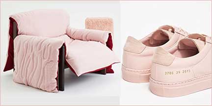
Even if you haven’t heard of “Millennial Pink” or didn’t know that it went by this name, this color isn’t going anywhere. It’s a desaturated shade of pink – a pale, chalky neutral with a warm tint - that millennials embrace as their genderless mascot. Interestingly, it’s not Barbie, it’s not bubblegum, not the pink of generations past. In short, the unpinkness of millennial pink is changing the way people think about the female experience. Refreshing!
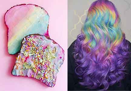
Rainbow-clad colors continue to broaden their influence in food, fashion, and beauty products. There are unicorn noodles and toast, unicorn tears lipstick, and products to turn your hair into a bright rainbow. Even luxury brand Louboutin offers "Unicorn skin" sequined boots that magically change color and Starbucks introduced a rainbow swirling Frappuccino.
The unicorn trend is characterized by pastel colors, rainbows, iridescent hues, pearly purples, an opalescent sheen, and everything shimmery. In some sense, they represent the magic of childhood - the colors of fantasy, optimism, and escapism.
Emerging in 2018
Bold and bright colors
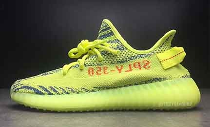
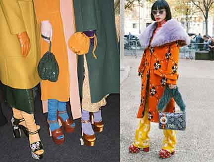
In fashion and interior design, the bold-color trend is emerging in 2018. Colors include reds, purples, hot pinks, and especially a color known as Frozen Yellow. Also worth noting is that packaging designers are using more solid intense colors to differentiate their products on the shelf.
Chaotic Mixes of Colors and Patterns
Color clashing is on the rise. Traditional color harmonies – such as complementary colors - are abandoned and in its place is a multi-tonal “dissonance”. These palettes may feel fresh and new, but they may wind up a misguided mess.
An even more dramatic trend is clashing colors combined with clashing patterns in both fashion and interior design. Picture a mix of Memphis and Paris.
To put it all in a perspective…
A fad is a flash-in-the pan, a trend is something with a little more practicality and purpose, and a style is something that continually re-invents itself over time to become a classic. - Linda DeFranco
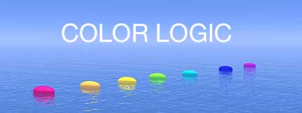
Color logic is practical color. It's a timeless tool for all designers. Check out the online courses at the Color Matters Design Academy and the Color Logic ebook from the author of this newsletter.
“The Color of the Year 2018”
Trend forecasting for a single year has become big business. Nearly every paint company names an “it” color – and this year selections are bold and deep. See “Paint retailers tap hues for2018”.

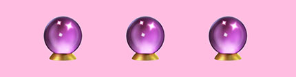
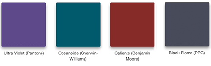
And then there’s Pantone. “Ultra Violet” was just designated the color of 2018. It’s worth noting that every year since 2000, the company has chosen a color that reflects the current cultural climate. In the following year, the color influences interior décor, fashion, food, and other facets of design.
However, the color of the year doesn’t apply to every brand or product. Also, there are no statistics that show that the color boosted sales of any consumer goods. Just bear in mind that any “color of the year” reflects a philosophical take on the year. Perhaps it’s all about getting you to look at a color in a new way - and it always gets attention.
Pause for a minute and consider two articles:
"The Big Money Behind Naming A “Color Of The Year” Jude Stewart writes, “How many top colors can you cram into a single year?” She presents a very realistic perspective on color trend forecasting.
*When color trends matter—and when to ignore them.
" Forecasting Ultra Violet’s popularity doesn’t mean making all your company’s ads purple. Capitalizing on design trends depends on your brand, your product or service, and your audience. Context is always key."
2019?
“Do Not Disturb” Colors
Clariant sees colors becoming muted as consumers come to grips with a complex world and never-ending distractions. As people feel that things are spinning out of control, focusing on single task is critical. The color palette for "Do not disturb" is simple: serene, soft, muted, and minimal colors.
What’s not hot?
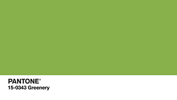 If last year's "Color of the Year" sensation is today’s blank stare, then it would be Pantone's Color of the Year 2017 Greenery and Benjamin Moore’s Shadow (a deep saturated purple) --- to name just a few. Do you really think that's true?
In conclusion, trends may come and go but color will always be the skin of the world.
When you subscribe to the blog, we will send you an e-mail when there are new updates on the site so you wouldn't miss them.

