Color Matters Blog
Designers that changed everything - and why color matters
Here’s a look at four successful designs, the artists who created them, and why color matters. I hope it inspires everyone whether you’re an amateur, pro, or just love to dabble.
Gmail logo mess fixed by amateur
![]()
When it was introduced in October, Gmail’s new logo looked off. The colors looked choppy. Now, thanks to an Evan Blass, an amateur designer, the logo was rebuilt. The new Gmail logo creates an illusion that the colors are overlapping – so blue and yellow make green, and yellow and red make orange. It makes more sense and it’s evidence of the importance of consistency in designing with color.
Covid designer
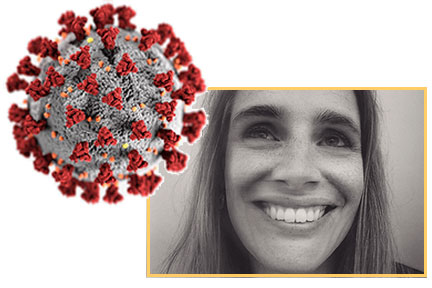
One image defines Covid-19 more than any other. There’s a lot to learn about scientific illustration and color when we look closely at the design and the designer behind the covid image.
Two medical illustrators at the Centers for Disease Control and Prevention (CDC) were assigned the task of creating something dramatic that would catch the public’s attention, a health emergency alert that would pop out of the page. In one weeks time. Designer Alissa Eckert explains that getting the colors to work correctly with the textures took much trial and error. In the end, they resulted in colors that relate to the public health warning aspect.
Her background is inspiring for all of you who are drawn to design: In her fourth year of college as a biology major, she was planning on going to veterinary school. She had taken art classes on the side but had never intended on doing it professionally, until she found out about medical illustration. She found a program at the University of Georgia and ended up at the CDC.
Veterans Day Designer
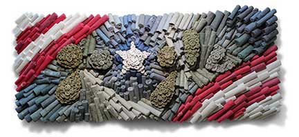
Google’s Veteran’s Day Doodle was eye-catching. Not only did it draw on the colors of patriotism in the US (red white and blue), but also it was built from hundreds of rolled up pieces of military uniforms that were once worn. The artist, Air Force veteran Jenn Hassin, explained that she transformed the uniforms into spirals as a symbol for life. Get inspired and read more about her focus on transformation and digging deeper below the surface.
Overdose designer
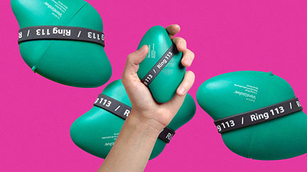
The opioid crisis is a tragedy – and overdose drugs are difficult to administer. A thoughtful new design is a nasal spray that is easier to use than existing devices – and can save more lives. Ventizolve, on the other hand, is a green, ergonomically shaped plastic case. It’s wrapped with a rubber band to prevent accidental opening, and which they say is also like an emergency pin, reminding the user of what they’re about to do: save a life. Editor’s note: Color matters. What a perfect color for this device.
A message from Color Matters
Online courses at the Color Matters Design Academy
When you subscribe to the blog, we will send you an e-mail when there are new updates on the site so you wouldn't miss them.

