
The human eye can see 7,000,000 colors. Some of these are eyesores. Certain colors and color relationships can be eye irritants, cause headaches, and wreak havoc with human vision. Other colors and color combinations are soothing. Consequently, the appropriate use of color can maximize productivity, minimize visual fatigue, and relax the whole body.
Which color is the most irritating?
![]() Yellow, pure bright lemon yellow is the most fatiguing color. Why? The answer comes from the physics of light and optics. More light is reflected by bright colors, resulting in excessive stimulation of the eyes. Therefore, yellow is an eye irritant. Some claim that babies cry more in yellow rooms, husbands and wives fight more in yellow kitchens, and opera singers throw more tantrums in yellow dressing rooms. However, these reports have not been scientifically proven.
Yellow, pure bright lemon yellow is the most fatiguing color. Why? The answer comes from the physics of light and optics. More light is reflected by bright colors, resulting in excessive stimulation of the eyes. Therefore, yellow is an eye irritant. Some claim that babies cry more in yellow rooms, husbands and wives fight more in yellow kitchens, and opera singers throw more tantrums in yellow dressing rooms. However, these reports have not been scientifically proven.
In practical application, bright yellow - when used in large areas, will irritate the eyes. Therefore, do not paint the walls of an office (or any critical task environment) yellow. Note: Lighter shades of yellow can be comforting and cheerful.
Also, beware of bright yellow legal pads (but this may give you a jolt and temporarily wake your brain up) and do not use yellow as a background on your computer monitor.
On the other hand, since yellow is the most visible color of all the colors, it is the first color that the human eye notices. Use it to get attention, such as a yellow sign with black text, or as an accent. Have you noticed yellow fire engines in some cities?
Finally, yellow is a wonderful color, the most cheerful of the spectrum. And yellow is a symbol of the deity in many global religions.
Some tips for practical application:
Notice the difference between a yellow of the purest intensity and a softer tint. Also the size of the area that any color occupies determines the color effect. For best results, use softer tints of the hue or small quantities. A little bit of color goes a long ways.
![]()
Find out more about yellow: "The Meanings of Yellow"
from our sponsors
See red?
![]() Perhaps you've used this phrase to mean that you're so angry that you literally see red. Here's a test to see if you really see red. And it will be a bit of magic because you will see the invisible.
Perhaps you've used this phrase to mean that you're so angry that you literally see red. Here's a test to see if you really see red. And it will be a bit of magic because you will see the invisible.
Instructions:
1. Make sure the image below fills your computer screen.
2. Look at the image at a distance of 12 inches or 30 centimeters from the screen.
3. Stare at the black dot in the middle of the red rectangle for 30 seconds. Keep your focus on the black dot or the test will not work.
4. After 30 seconds, shift your focus to the black dot in the middle of the white rectangle. Once again, you must focus on the black dot in the middle of the white square or this will not work.
Begin!
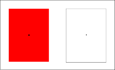
Did you see red? Probably not. What did you see?
You are not hallucinating. You saw an "after image" and there is a very scientific explanation for it: Your eye is filled with 250,000 color decoding cones. The 83,000 cones that are used to decode red became fatigued and over stimulated when you focused on the red rectangle. Consequently, the opposing cones kicked into action. You probably saw blue or bluish green, somewhat like transparent bluish light or cellophane on the white area. (If you saw nothing, reread the instructions and take the test again.)
The operation of the eye is largely muscular and any excessive activity will tire it out. Note: Some scientists have noted that after-images are caused by a depletion of certain chemicals in the rods and cones of the eye, which are sensory cells, not muscles.
Here are some practical examples of how colors cause visual fatigue:
Let's assume that you work on an assembly line and sort red pills 8 hours a day. If the work surface is white, you'll fatigue the eyes and get an after image. If you use a soft muted teal as the work surface color, you'll maximize visual efficiency. "After image" will occur with any color. Imagine what would happen if you were in a monochromatic blue interior. Which color would your eyes be hungry for?
What happens when chickens see red?
A company* that markets red contact lenses for chickens (at 20 cents a pair), points to medical studies showing that chickens wearing red-tinted contact lenses behave differently from birds that don't. They eat less, produce more and don't fight as much. This decreases aggressive tendencies and birds are less likely to peck at each other causing injury. A spokesman said the lenses will improve world egg-laying productivity by $600 million a year.
(Perhaps everything looks red and they cannot distinguish combs, wattles, or blood. Or ...perhaps the chickens are happier because they're viewing the world through rose colored glasses.)
* Animalens Inc. of Wellesley, Mass
If you don't believe this, read the facts! Click here.
Stay in touch with the latest news about color in the Color Matters bi-monthly newsletter. Subscribe and get a free copy of “The 3 Most Common Color Mistakes".
Another eye test
Once again, follow the same instructions:
1. Make sure the image below fills your computer screen.
2. Look at the image at a distance of 8-12 inches or 20-30 centimeters from the screen.
3. Stare at the black dot in the middle of the white star for 30 seconds. Keep your focus on the black dot or the test will not work.
4. After 30 seconds, shift your focus to the black dot in the middle of the white rectangle. Once again, you must focus, you absolutely must hold your focus on the black dot in the middle of the white square after the 30 seconds pass, or this will not work.
Begin!
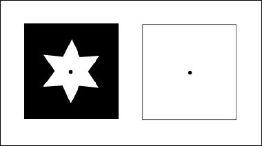
What did you see?
This time the issue is color contrast. The difference between white and black creates excessive muscular activity which fatigues the eye. The same thing happens when you try to read white papers on a black or dark desk. You should have seen a grey star on the white square. If you didn't, reread the instructions, and take the test again. Make sure you are close enough to the image.
Here are some practical examples:
If you're in a corporate office, take this theory into the conference room or corporate boardroom. In many instances, you'll find a dark surface, and oftentimes highly lacquered. It may have a high tech corporate look but it will not be conducive to the work at hand. As for your private residence, the kitchen is a critical task environment and the same theories apply.
The scientific explanation is as follows:
White surfaces reflect about 80% of the light, black 5%.
We take these two percentages, divide 80 by 5 and we get a 16:1 Light Reflectance ratio. The Illuminating Engineering Society (IES) in the United States recommends a maximum ratio of 3:1 for a visual task and the adjacent surroundings.
If you're in a commercial situation, consider hiring a professional interior designer who focuses on both visual ergonomics and aesthetics to create a more positive and productive interior environment.
You might also be interested in this page at Color Matters
![]()
How does color affect taste? Which color might help you lose weight? Don't miss this interesting article: How Color Affects Taste and Smell