Color Design and Psychology for Branding
Brands and color are inextricably linked because color offers an instantaneous method for conveying meaning and message without words.

Branding is a word commonly referred to by advertisers and marketing people, but what does it actually mean? Marketing experts define "brand" as the "name, term, sign, symbol or design, or a combination of them intended to identify a company's products or services." In other words, a brand communicates the "idea" of company or product. This is what forms the connection with consumers.
For example, in the illustration of the 3 brand images above:
The JAL (Japan AirLines) image has several components: The bird symbolizes flight and the color red communicates power. Red also symbolizes good luck in Asia. The circle and the color red reference the flag of Japan. Therefore, the brand image communicates powerful air transportation from a Japanese company — and good luck with the journey.
The AT&T image is an award-winning design. The globe symbolizes a world circled by electronic communications. More specifically, the symbol is made up of very carefully delineated 'highlight' and 'shadow' elements. As a result, the symbol may be reproduced to give the impression of a three-dimensional sphere that is lighted from a distance source. (Source) Test yourself on what blue symbolizes.
The UPS (United Parcel Service) image is an excellent example of how a single color communicates meaning. Brown symbolizes dependability and solidity. (It is not a snobby color; it is not high technology; brown is grounded in the earth.)
The Power of Images
A single image delivers a lot of information in a very short time because we perceive an image all at once, whereas reading or hearing often takes significantly longer to process the same information.
A recent study found that images of brands trigger religious reactions. (Source) Dr. Gemma Calvert discovered that when people viewed images associated with the strong brands— the iPod, the Harley-Davidson, the Ferrari, and others— their brains registered the exact same patterns of activity as they did when they viewed the religious images.
The Power of Shapes and Colors
Brands communicate meanings with the language of color and shape. As the overused cliché says, "A picture is worth a thousand words."
There are natural — or universal — associations evoked by shapes and colors that are common to all of us: For example, a horizontal line is stable and a diagonal line is dynamic. Red is hot and full of fire, blue is cool and watery — or intangible like the sky.
About Shapes
Colors and shapes work in harmony with each other to communicate. Therefore, an understanding of shapes is essential to understanding the power of color in branding.
Even the most basic geometrical shapes can be soft or hard, stable or threatening. The image below illustrates basic geometric shapes and contemporary symbols that evolved from basic shapes.
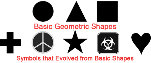
The Power of Color
Our minds are programmed to respond to color. For example, we stop our cars for red lights and go on green.
Consider the effects of color in the image of contemporary symbols below.

The Power of Color for Brands
Brands and color are inextricably linked because color offers an instantaneous method for conveying meaning and message without words.
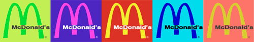
Color is the visual component people remember most about a brand followed closely by shapes/symbols then numbers and finally words. For example, the real McDonald's is easy to detect in the image below.
People see color before they absorb anything else.
Many of the most recognizable brands in the world rely on color as a key factor in their instant recognition. (See for yourself and take the "Recognizable Brands Test" at the end of this article.)
Trustworthy formulas for energizing your brand’s personality
Color Psychology for Logos and Branding
Why Color Matters Facts
Research has reinforced that 60% of the time people will decide if they are attracted or not to a message - based on color alone!
Color increases brand recognition by up to 80 percent. (Source: University of Loyola, Maryland study)
Read more color facts about "Why Color Matters"
Examples of Color Branding
1. Natural and Universal Color Symbolism for Brands
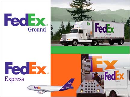
FedEx's two different color schemes are the best examples of the "universal" symbolism of colors. Green communicates ground services; orange communicates the high energy and speed of air transportation.
Another example can be found in a common household product—laundry detergent.
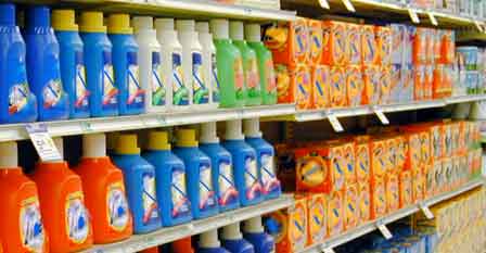
The next time you're in a grocery store, look at the colors of laundry detergents. An overwhelming majority are blue and orange. Blue symbolizes cleanliness and orange is dynamic energy. Therefore, a blue and orange package would clearly communicate "industrial strength cleaning power."

Cigarette packaging is another example of color branding. Notice how every menthol brand uses some shade of green to distinguish menthol from the natural flavor of tobacco. Now that new tobacco laws in the U.S. ban the use of the word light to imply that some cigarettes are safer than others, cigarette companies are using gold, silver and lighter colors to circumvent the law.
Australia will be the first country in the world to require tobacco products to be sold in plain packaging. The new legislation will be implemented throughout the country in December 2012. Legislation in other countries may require dull olive brown packaging or graphic images of health risks on the packaging.

2. Creative and Imaginative Color Symbolism
![]()
Some brands break with color traditions. T-Mobile's magenta (hot pink) is an unexpected color in the crowded cellular communications marketplace. Risky but it does succeed in creating a unique identity of the brands.
3. Good and Bad Color Branding
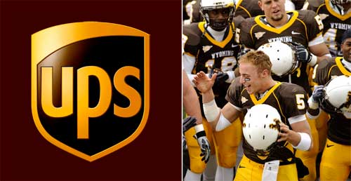
The colors of football team uniforms are also branding images. But sometimes the colors are horribly wrong. For example, the colors of Wyoming's football uniforms were cited as one of the worst in college football. (Source) Why do you think that brown is such a tough color to accept as a sports uniform? It works for UPS. Here's a hint: Brown isn't the most powerful color of the spectrum. It's as dependable as Mother Earth, but it lacks energy.
In conclusion, if you're questioning the power of color in branding, look at this example:

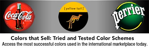
Find the best colors for your business in "Colors that Sell" - an e-book from Color Matters.
This article was written by Jill Morton, color psychologist and branding expert at Colorcom
©Jill Morton, 2012, All rights reserved / Protected by Copyscape
Links to other articles on this topic:
Color Branding & Trademark Rights
Color Matters Blog - Color Infringement: Microsoft vs. Google - 2009
![]()
We just launched two new online courses about color for logos and branding. Learn how to empower your brand with color in two hours time or less. Check out "Color Psychology for Logos and Branding" and "Color Harmony for Logos and Branding".

Stay in touch with the latest news about color in this bi-monthly newsletter. Sign up and get a free copy of “The 3 Most Common Color Mistakes".

