Color Matters Blog
The Colors of the Year 2020
The breaking news about all the "Colors of the Year 2020".
"First Light" – Benjamin Moore
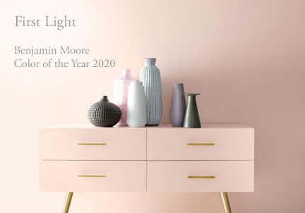
“First Light” (2102-70) is Benjamin Moore's "Color of the Year 2020". It’s a soft airy hue – not too sweet. The brand describes it as “a backdrop for a bright new decade”. Worth noting is that pink has become more of a mainstream color thanks to Millennial Pink. In this case, you might consider “First Light” as the new white. It’s blooming with potential!
"Naval" – Sherwin Williams

"Naval" (SW 6244) is Sherwin Williams’ "Color of the Year 2020". It brings navy blue into a new era. The company describes it as a deep shade that “fuses the striking and bold opulence of Art Deco with the awe‐inspiring power of nature”. Naval was designed to do just that, inspiring a sense of "restfulness and tranquility" in one's home, according to a press release.
"Back to Nature" – Behr
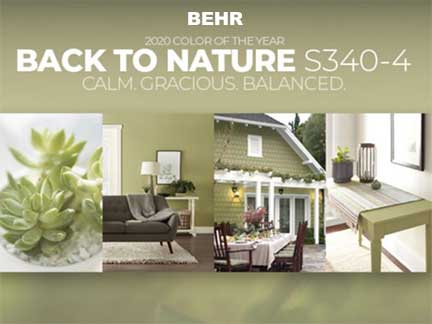
Behr released “Back to Nature” as its "Color of the Year 2020" in mid- August. It’s a meadow-inspired light green hue that the brand describes as "calm, gracious, and balanced, and a way to bring the outside in.” Look closely at this complex color. It’s a very subdued olive green. Murky and peaceful.
"Chinese Porcelain" - PPG
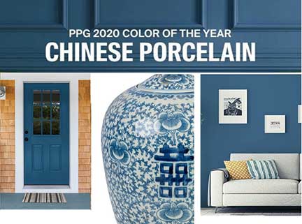
PPG proclaimed "Chinese Porcelain" as its "Color of the Year 2020" in June. It’s described as a blend of cobalt and moody, ink blue that imparts calmness and restful sleep while also offering the spirit of hopefulness – a rare commodity in a restless world.”
Nothing - Glidden
Glidden announced it’s not announcing a "2020 Color of the Year". As a matter of fact, this is the brand’s official breakup letter with "Color of the Year" selections. Glidden wants to help do-it-yourselfers and procrastinators get rolling on the paint projects they’ve been putting off by cutting ties with trends and simplifying the color selection process. (Editor's note: Cheers! Point well taken.)
Conclusion:
Most interior designers feel grey is on its way out. They’re tired of those stark and simple greys and color is coming back.

Would you prefer that your home or workplace be colorful or full of color? Make it happen with one of these easy courses from Color Matters:
Foolproof Color Formulas for Interior Design or Color Harmony for Your Home.
When you subscribe to the blog, we will send you an e-mail when there are new updates on the site so you wouldn't miss them.

